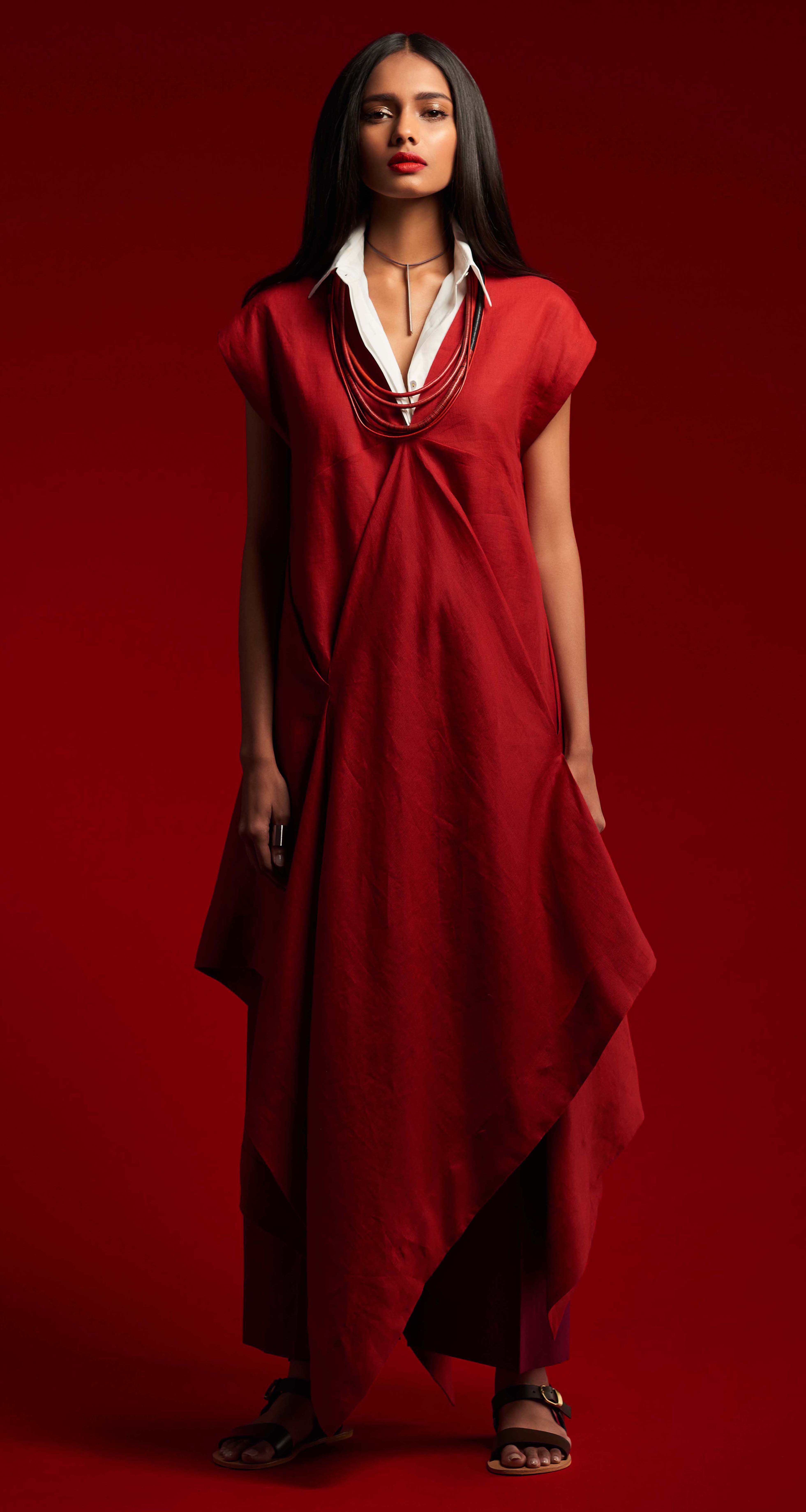
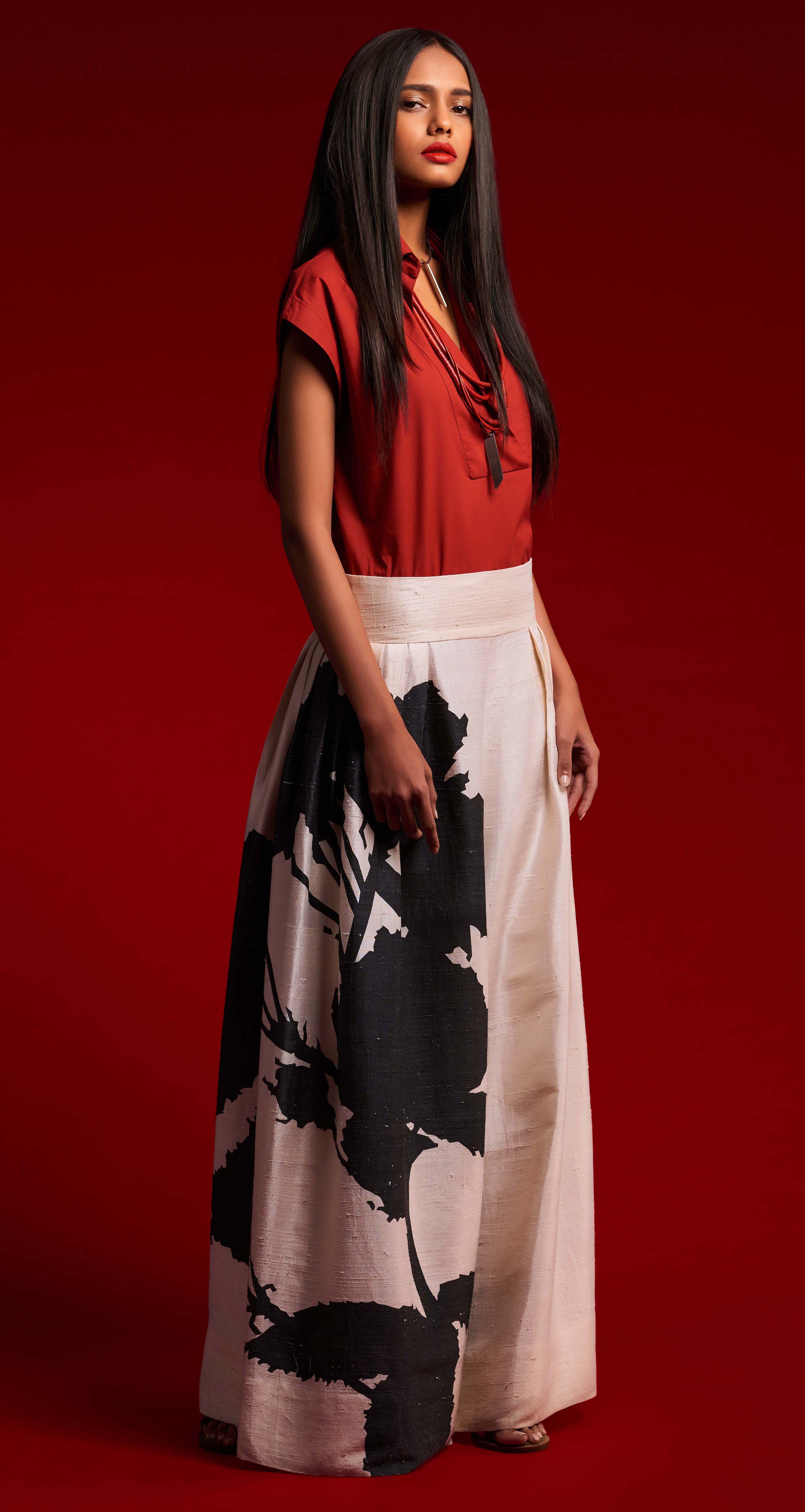
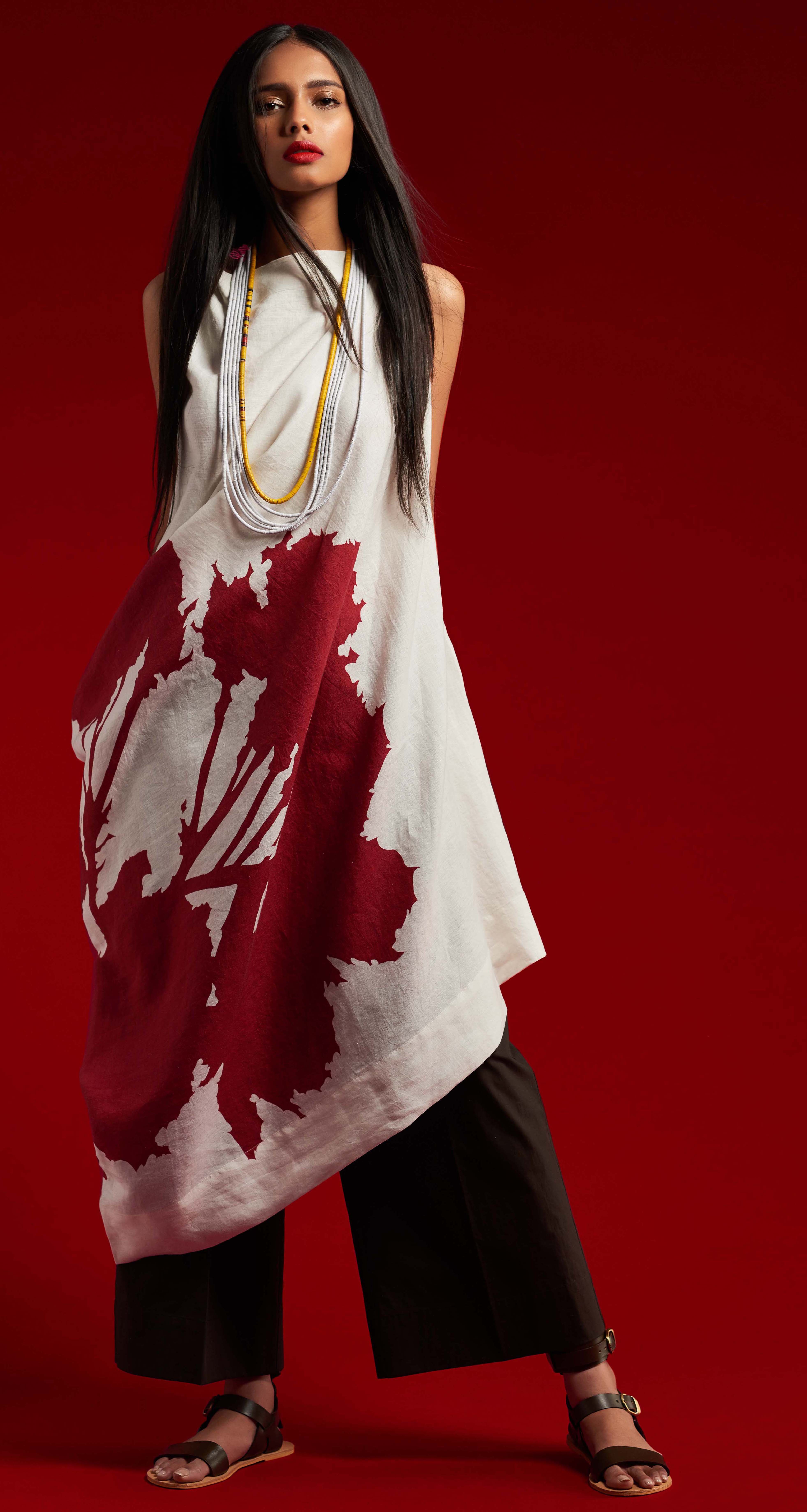
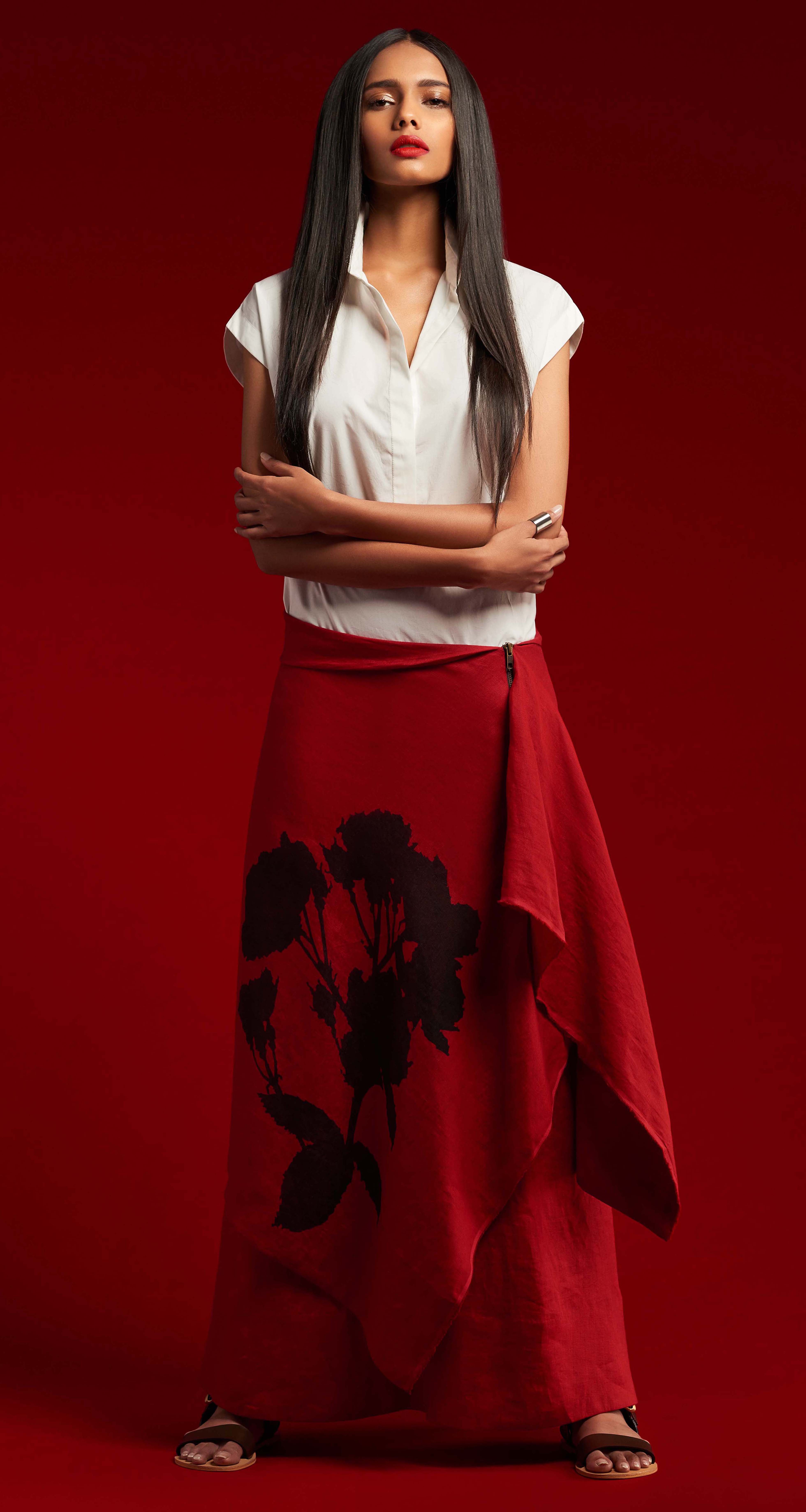
As we celebrate our 5th anniversary this spring, I wanted to make a
concerted effort to focus on our brand’s core philosophy. Our strengths
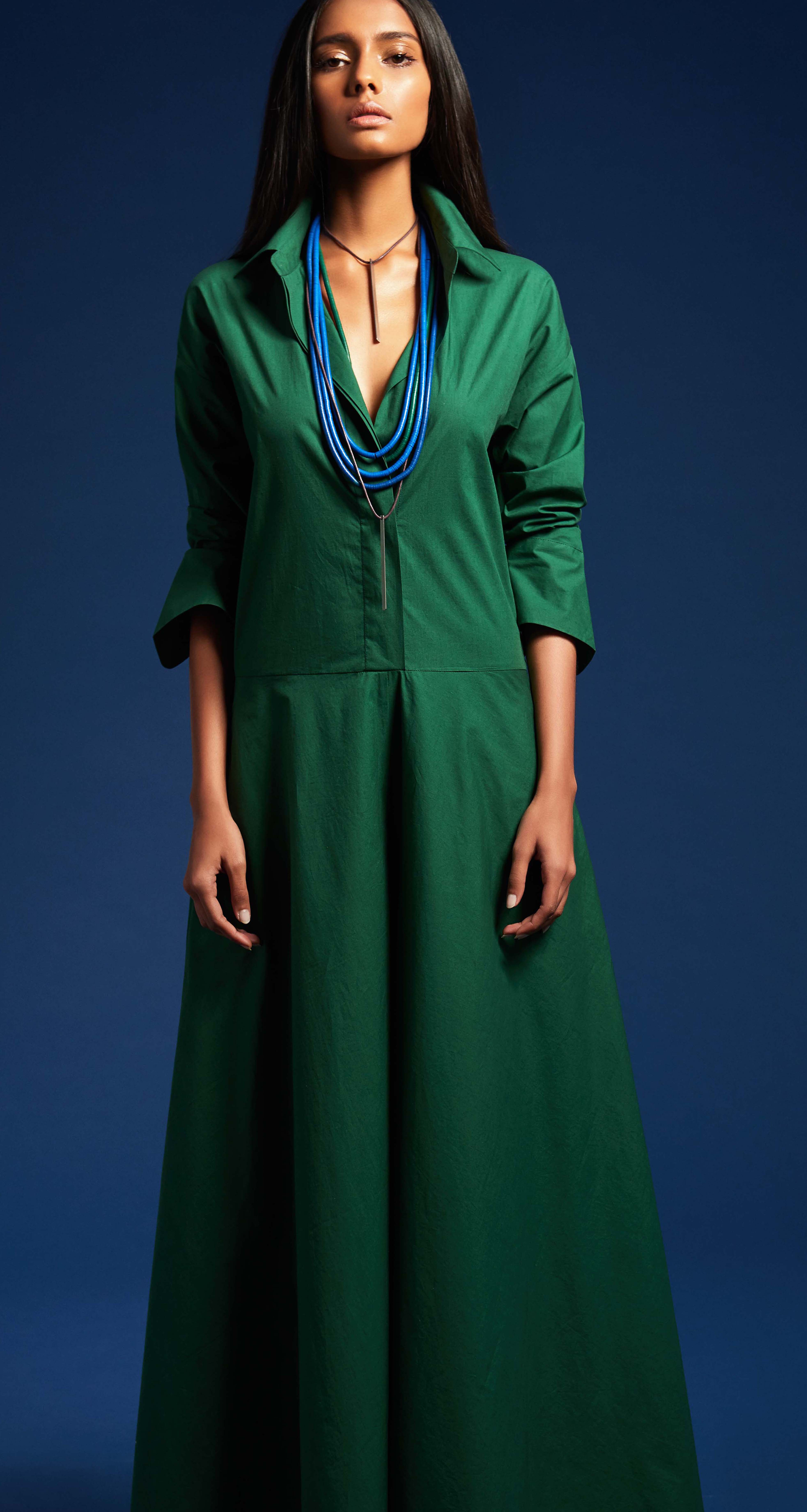
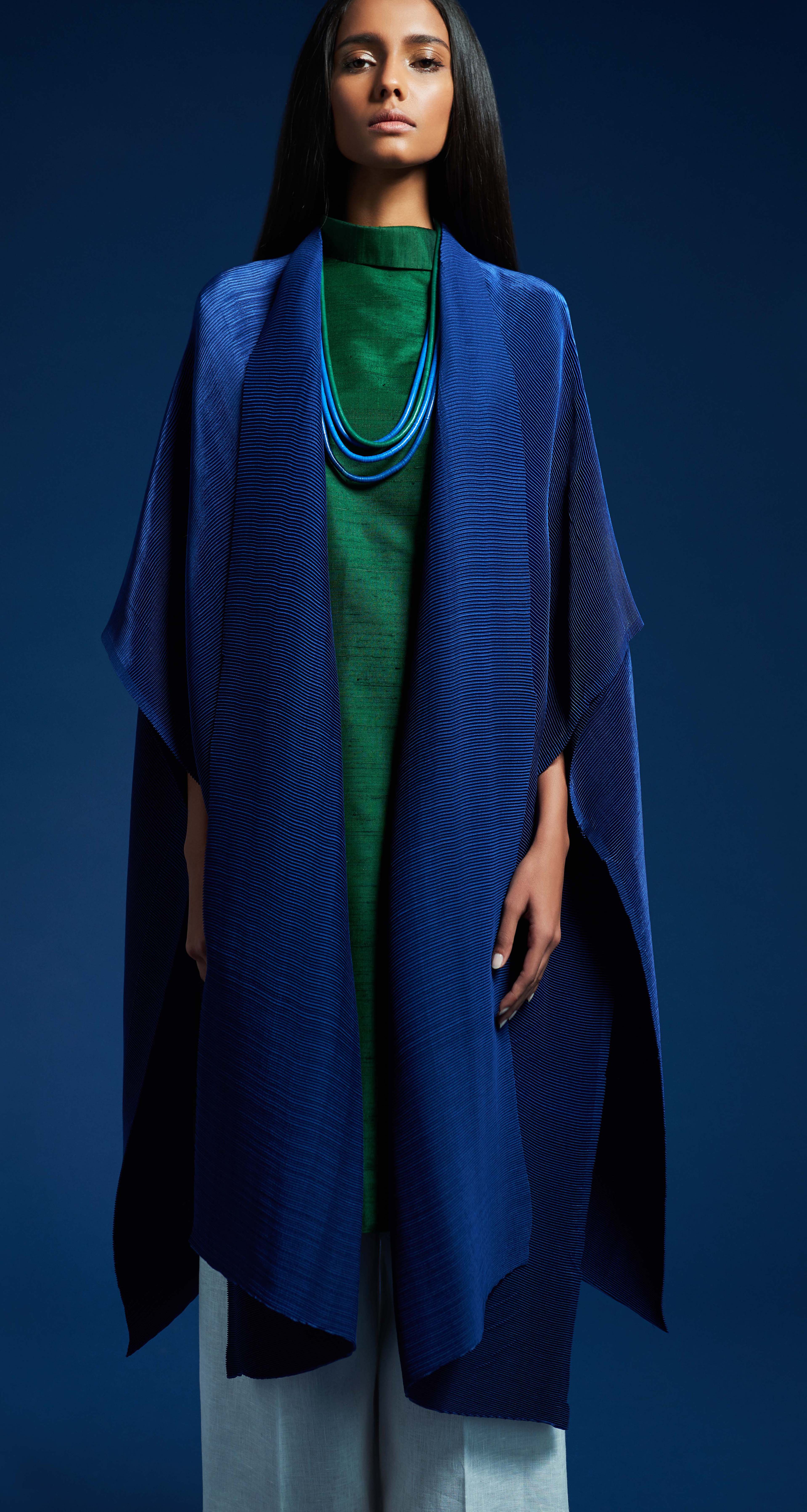
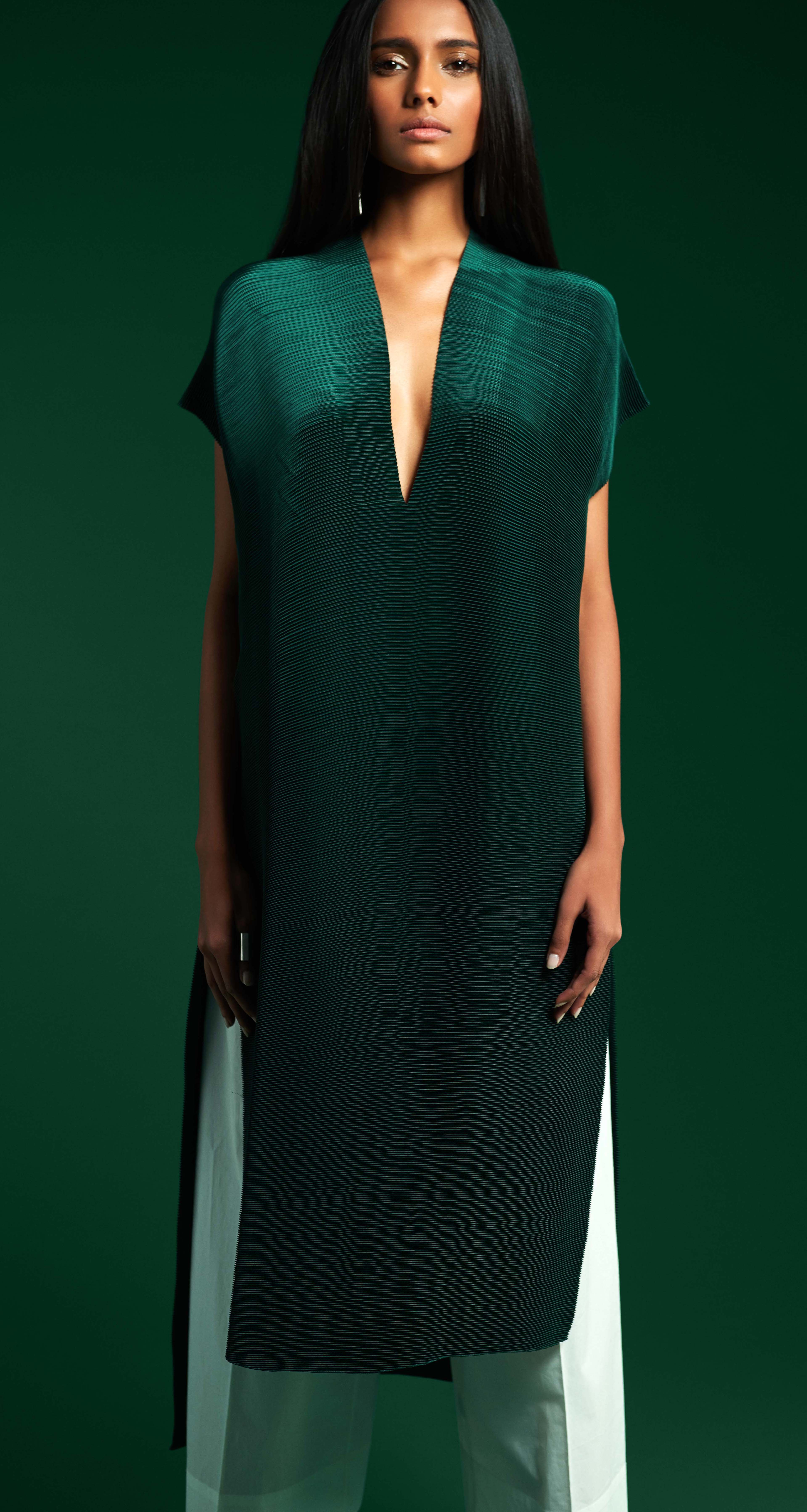
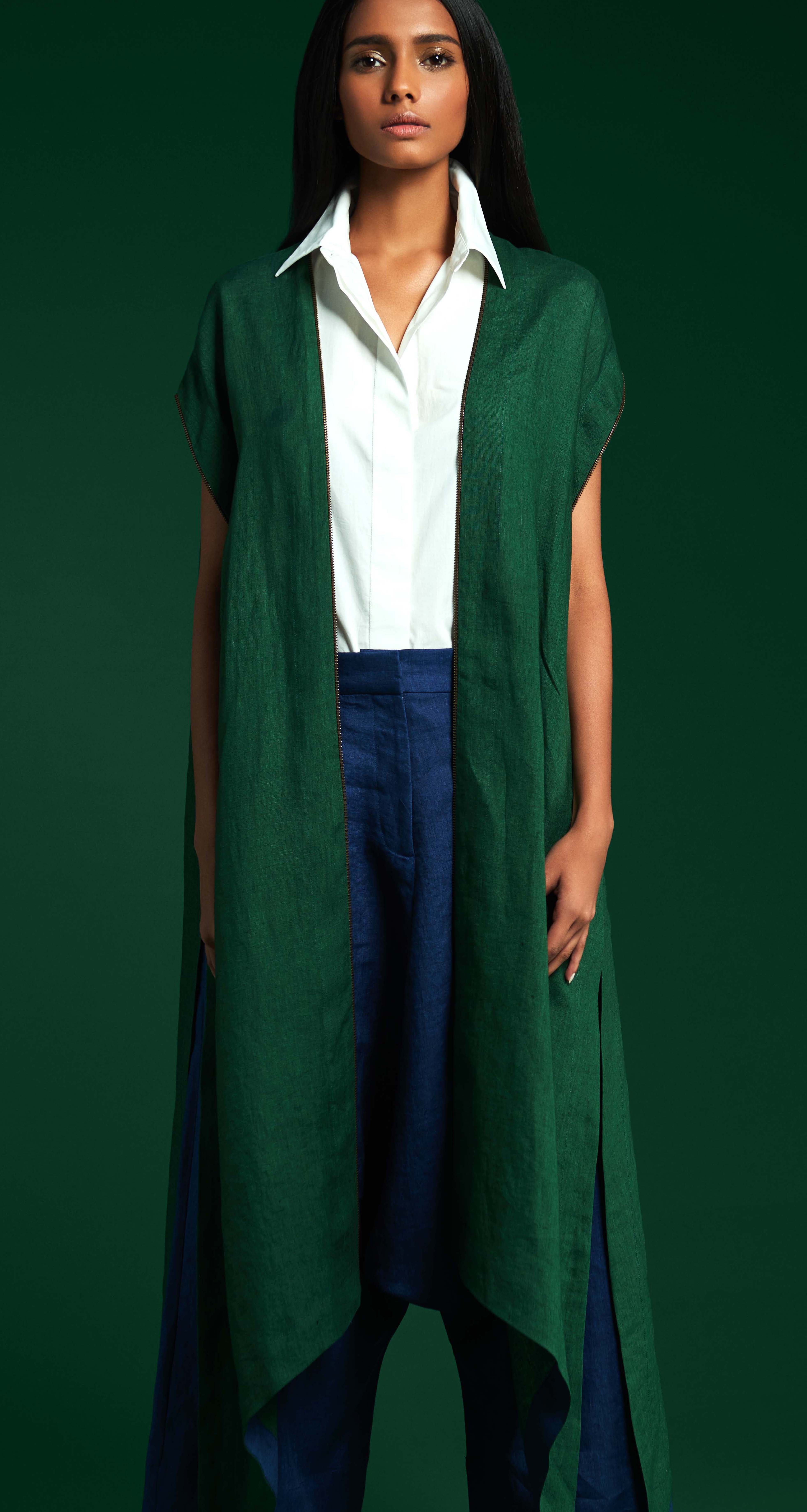
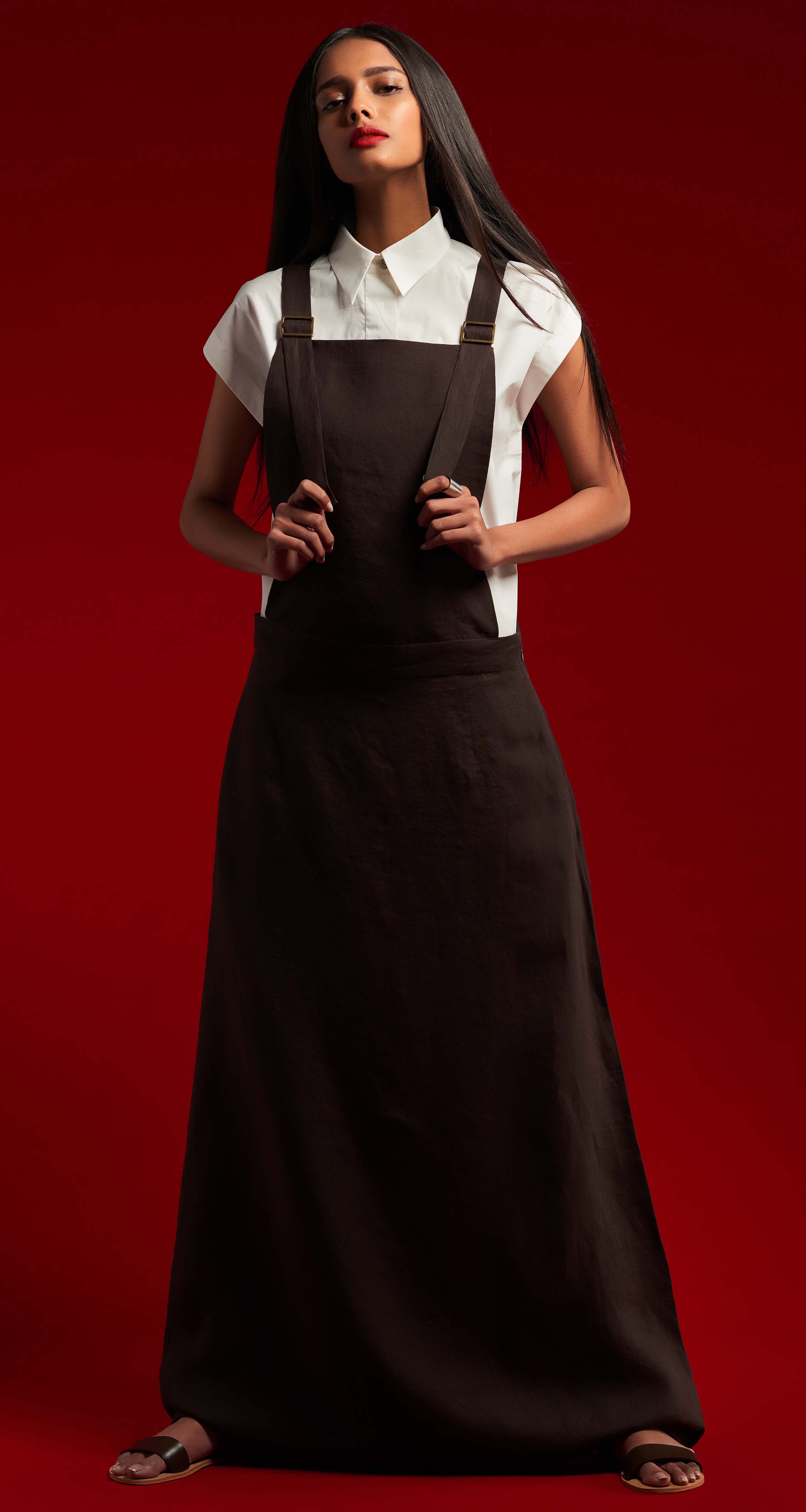
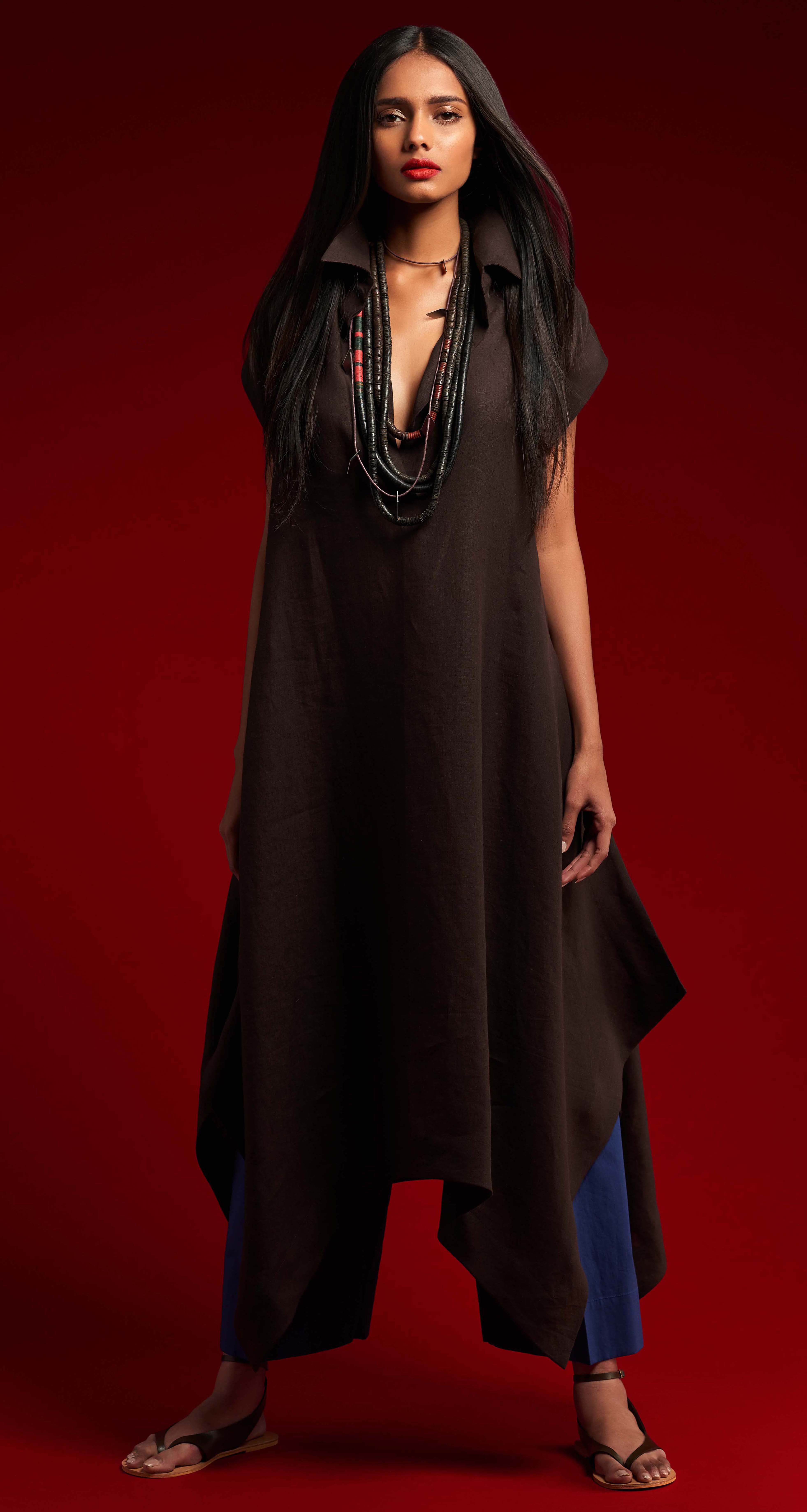
have constantly been colour, proportion and silhouette while being attentive
in creating clothes that are both simple and strong. This season allowed me
to reflect on what makes our label distinctive, as well as the learning that
comes along with building our brand from its early days in our living room
five years ago.
As a philosophy we have never focused on trends or even fashion for that
matter, because my impetus to establish the distinct grammar of our label
has always come from within. External factors do not drive or inform my
design decisions. In this regard our garments have always maintained a
very personal point of view, shapes are both free spirited yet classic and
remain easy but luxurious.
This is a point of view that is not born of references but instead comes from
a more intimate requisite. A need to offer stylish clothes that can be worn in
several ways and comfortable clothes that can take you from the morning
at work, right through a night out.It is this honesty, and therefore
consistency in the brand that allows our clothes to maintain a timeless
elegance that favours personal style over fashion.
I’ve always maintained that I design these clothes because this is what I
know best and this is what I wear, not because it’s what the market wants,
because it belongs or because it’s edgy.So my focus still continues to be
on how to innovate, within the constructs of drape and structure, colour and
neutrals, form and function.
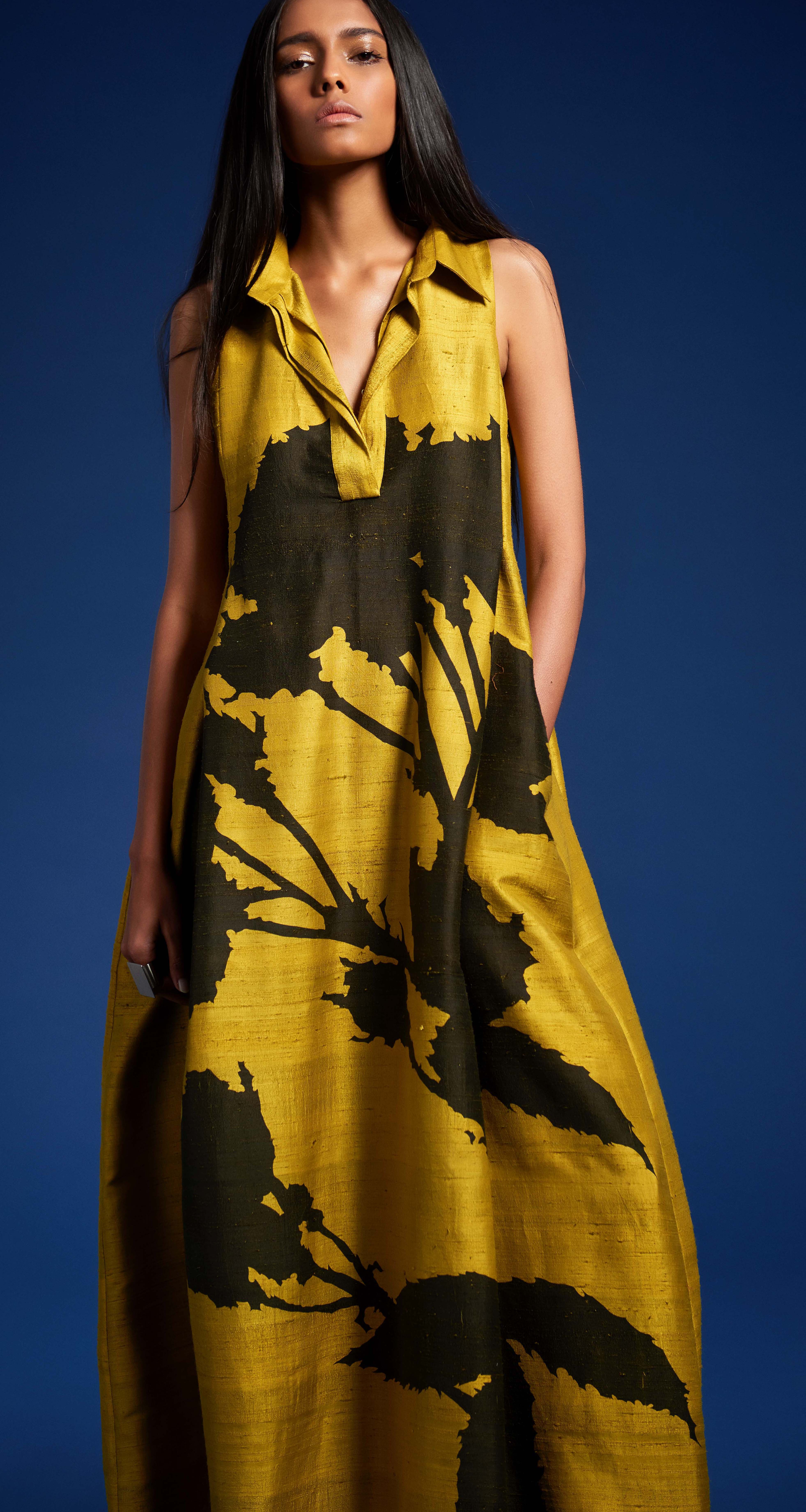
As a painter I love the idea of a strong visual to communicate a
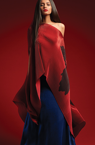
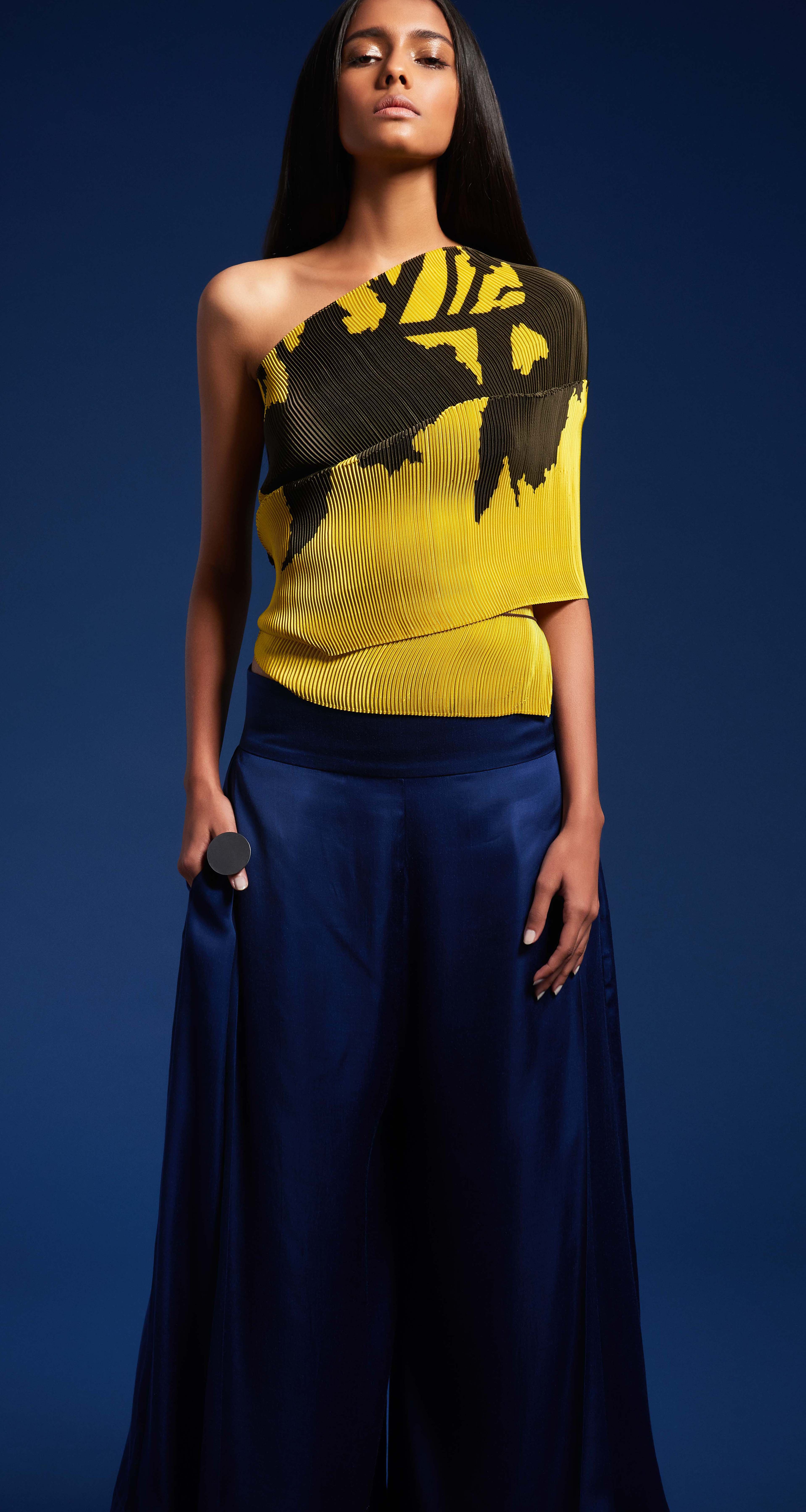
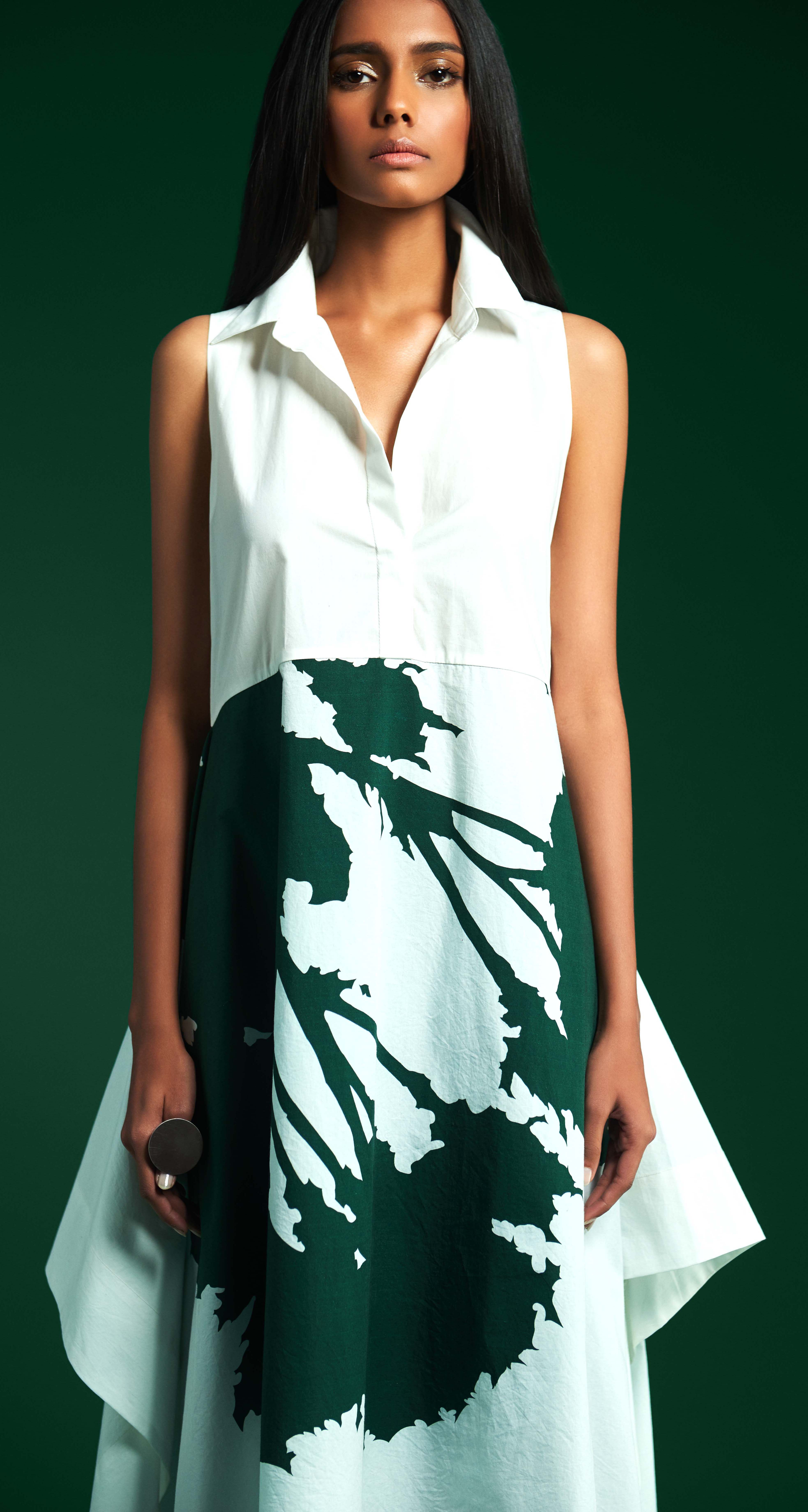
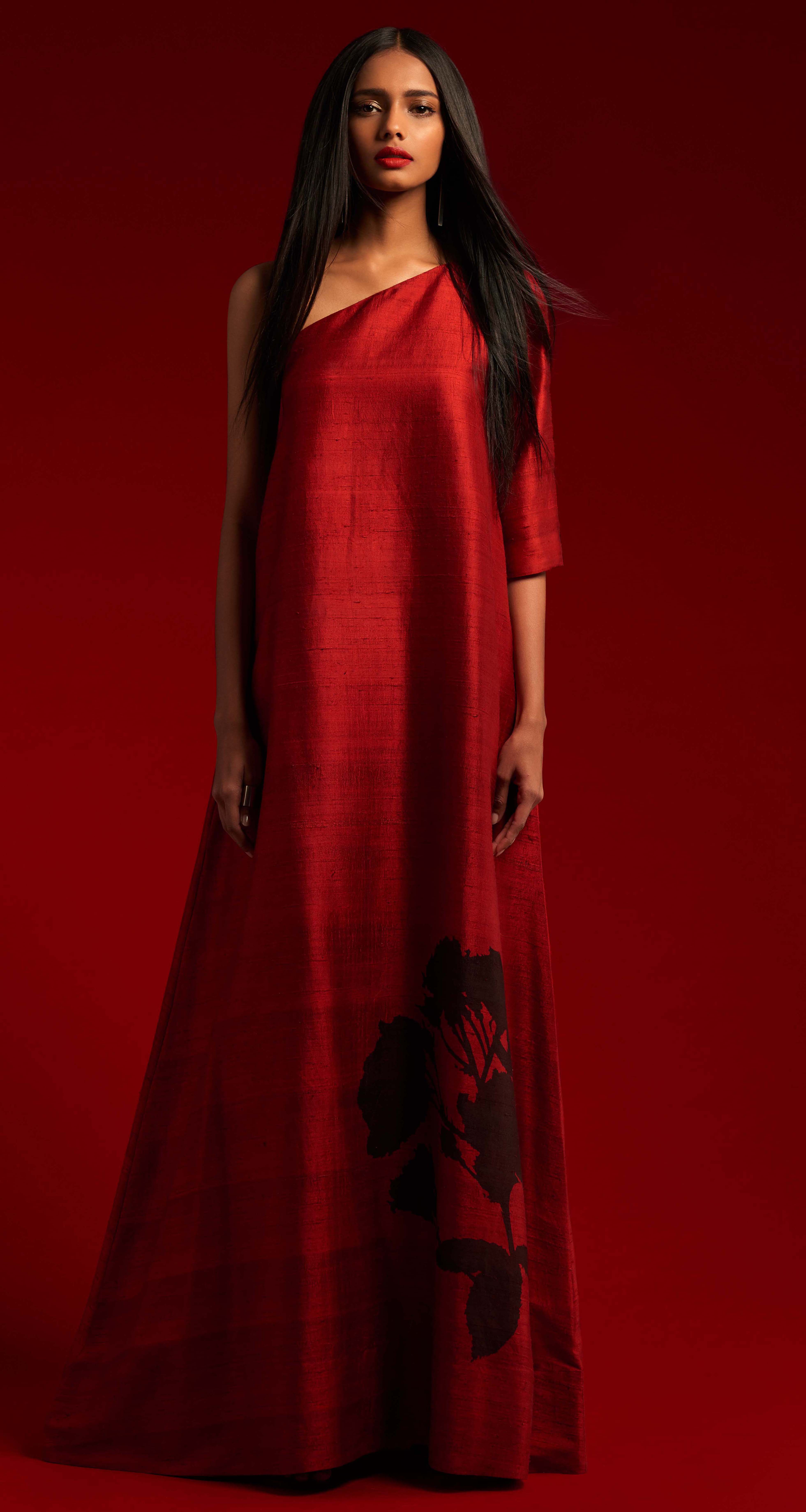
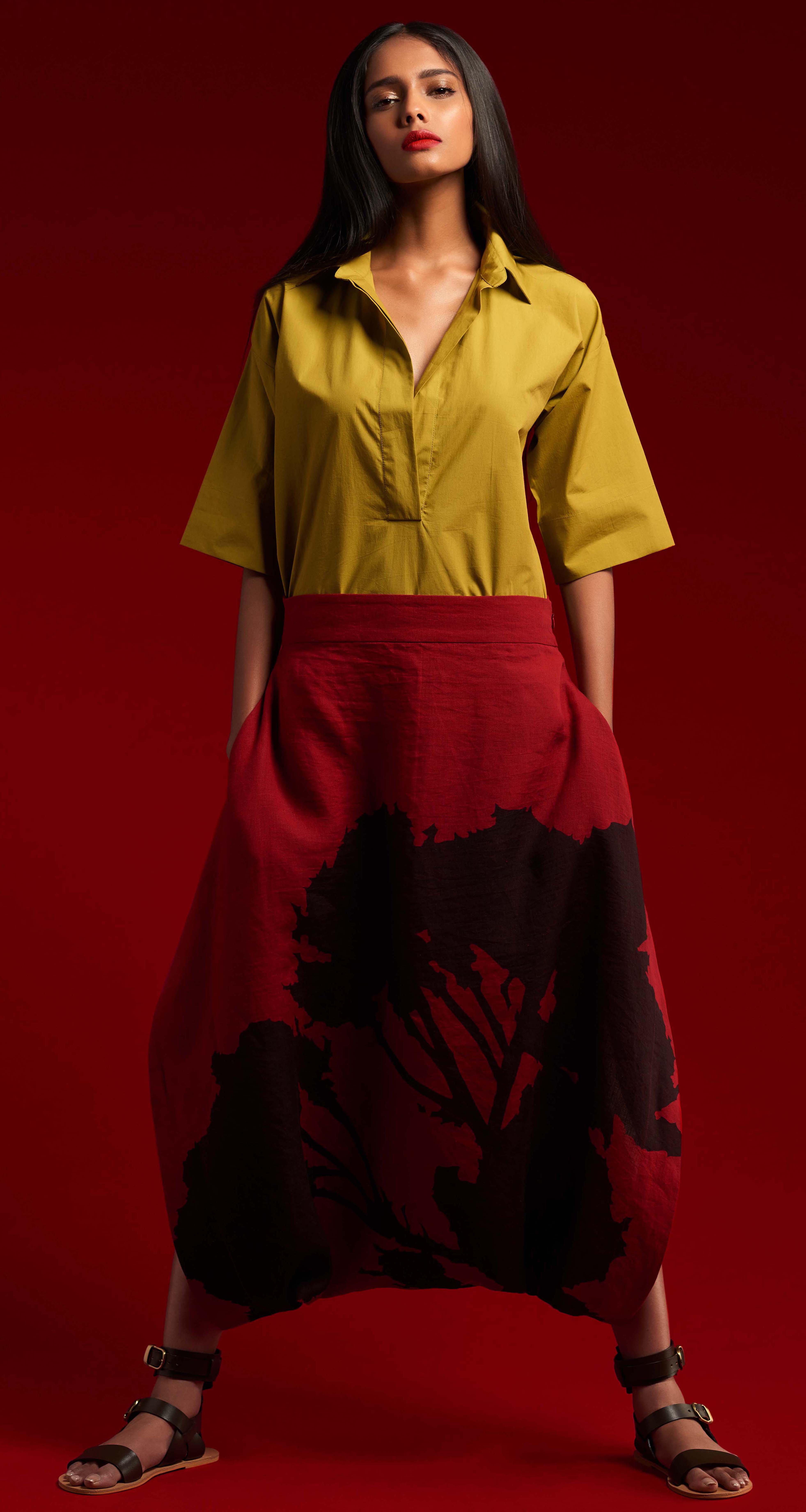
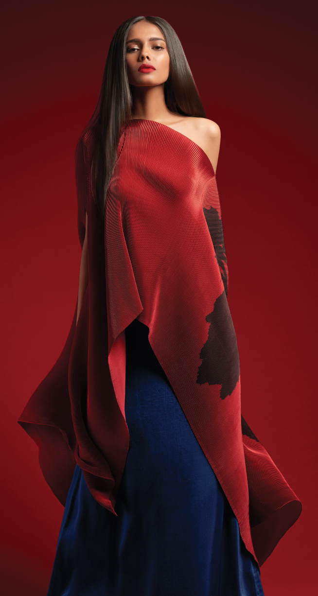
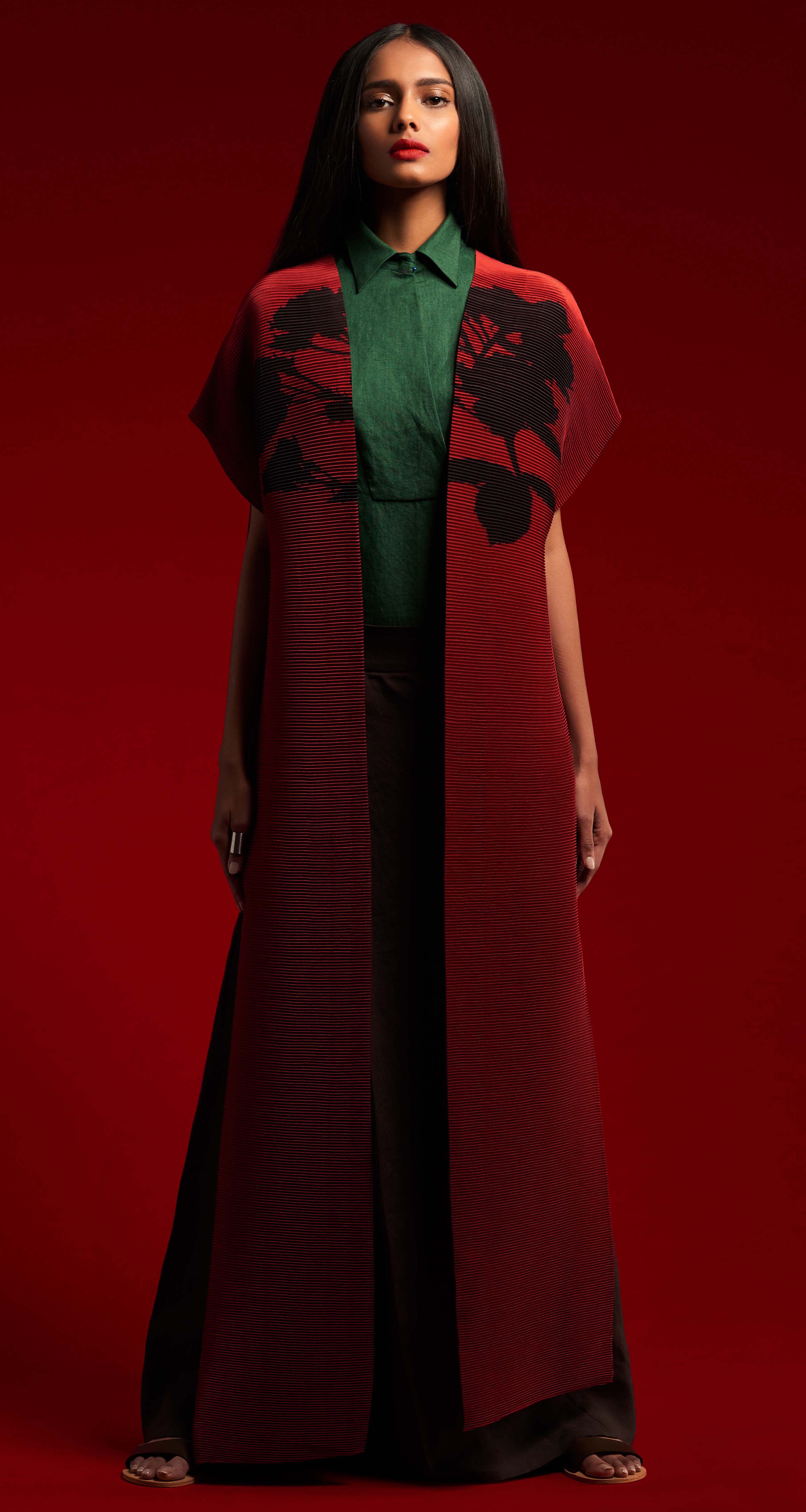
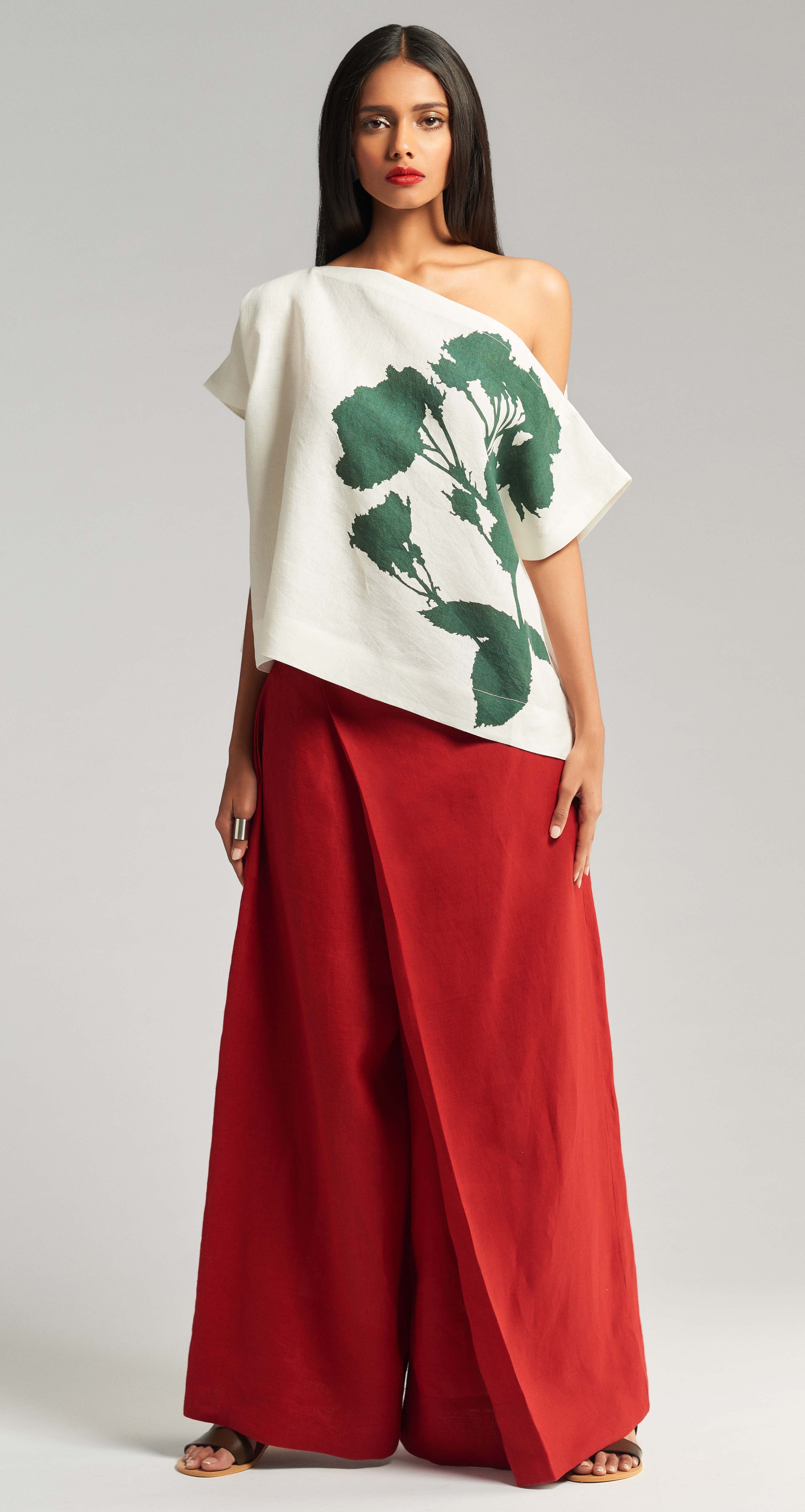
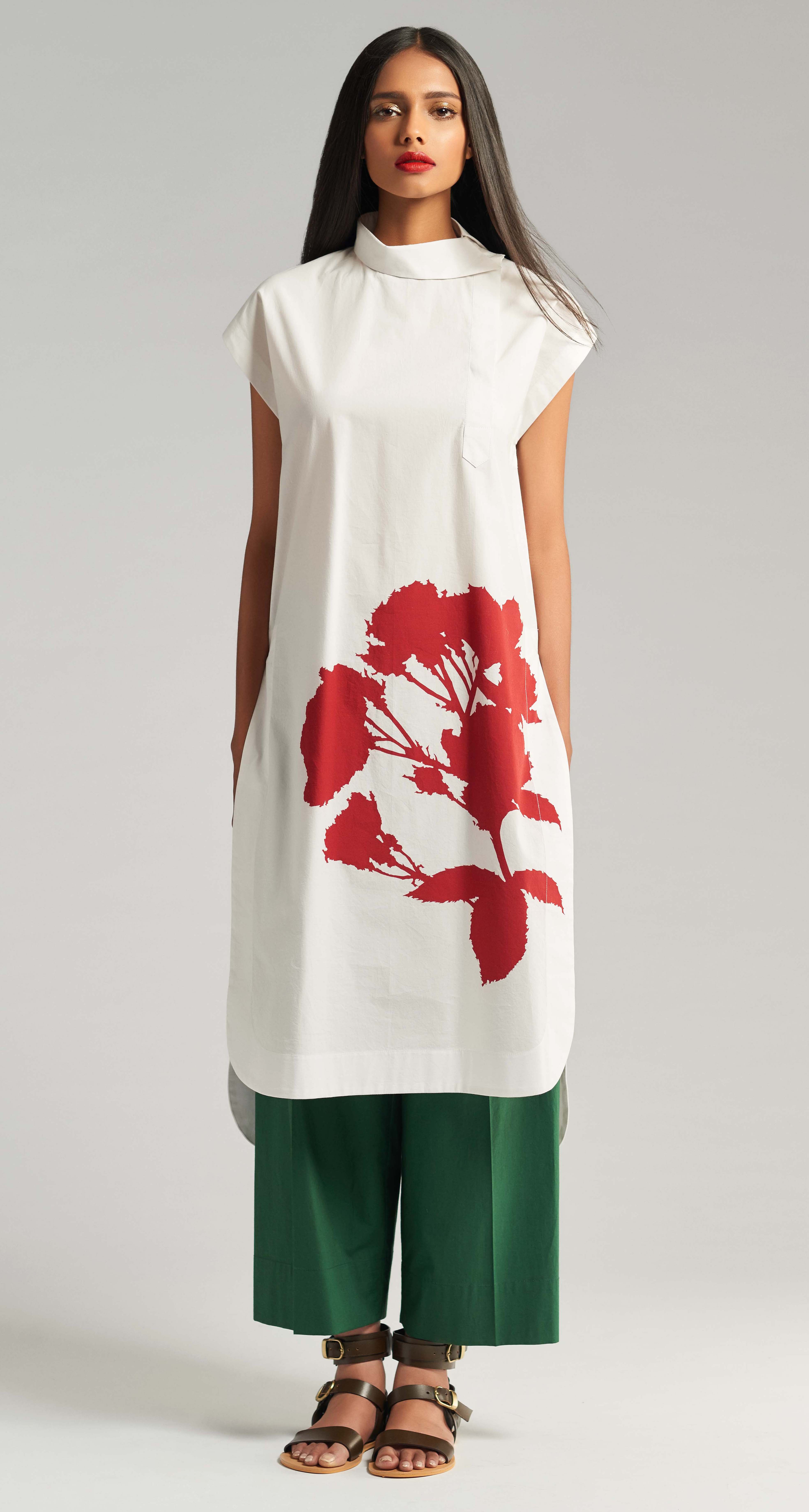
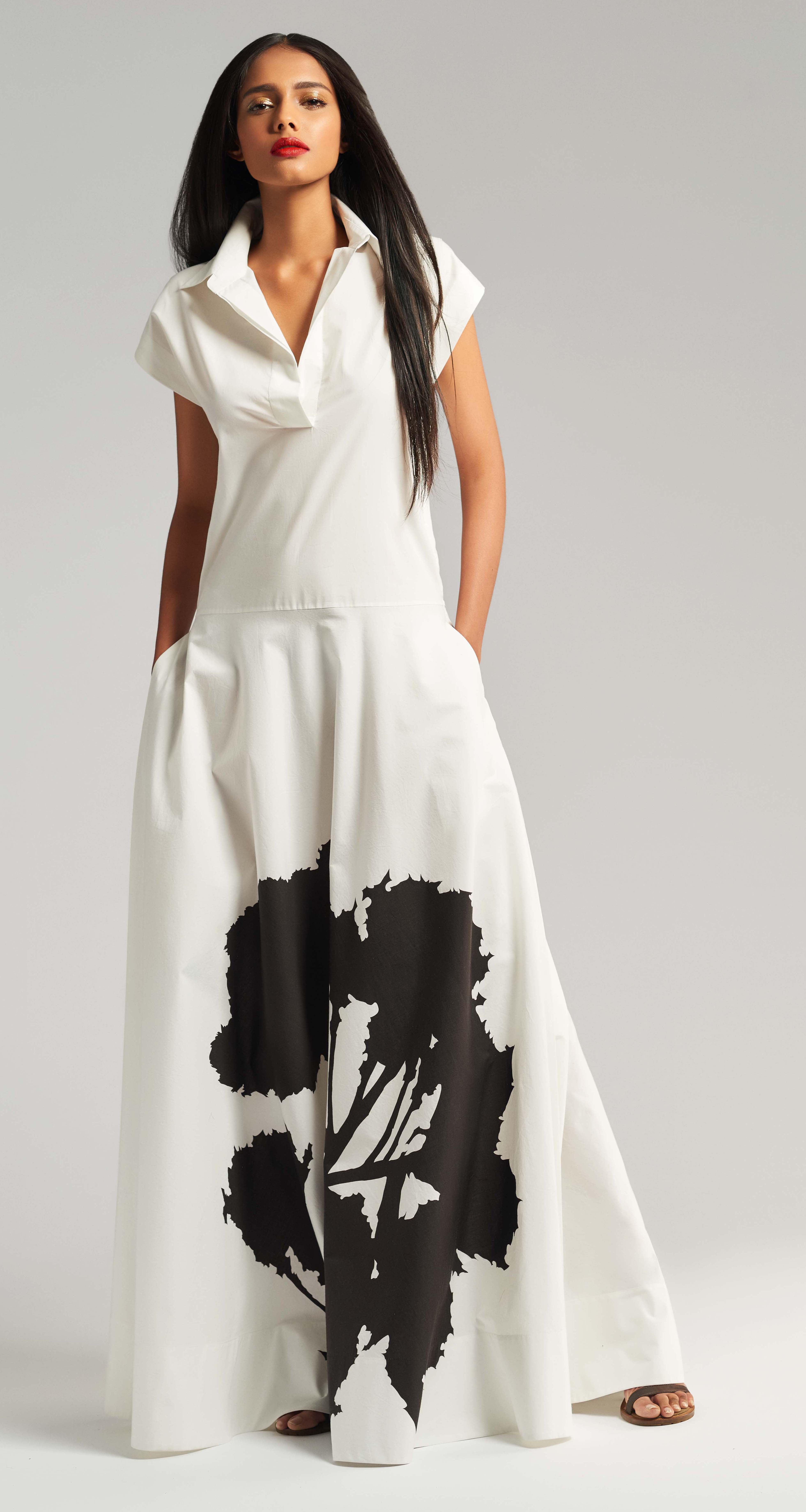
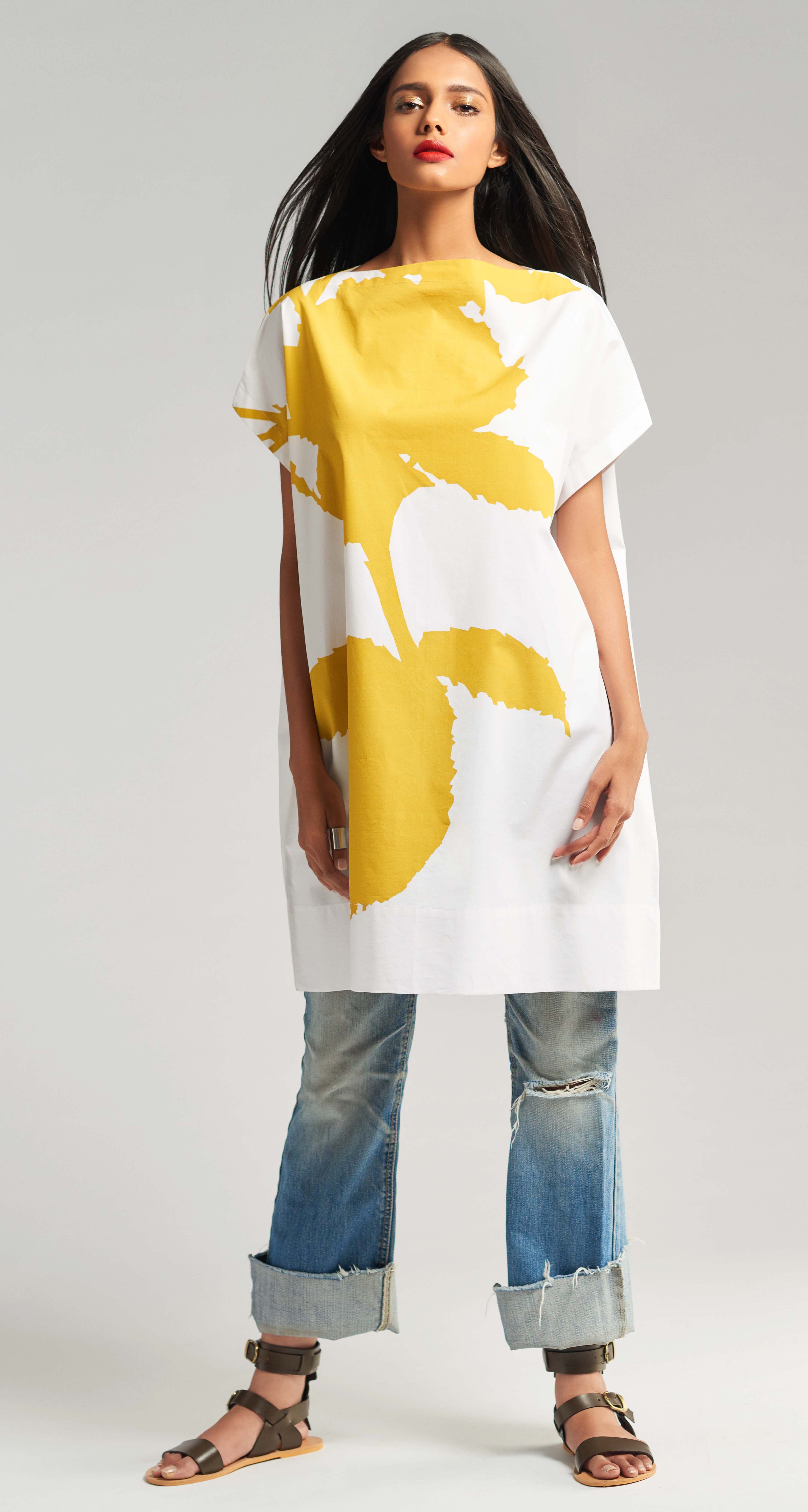
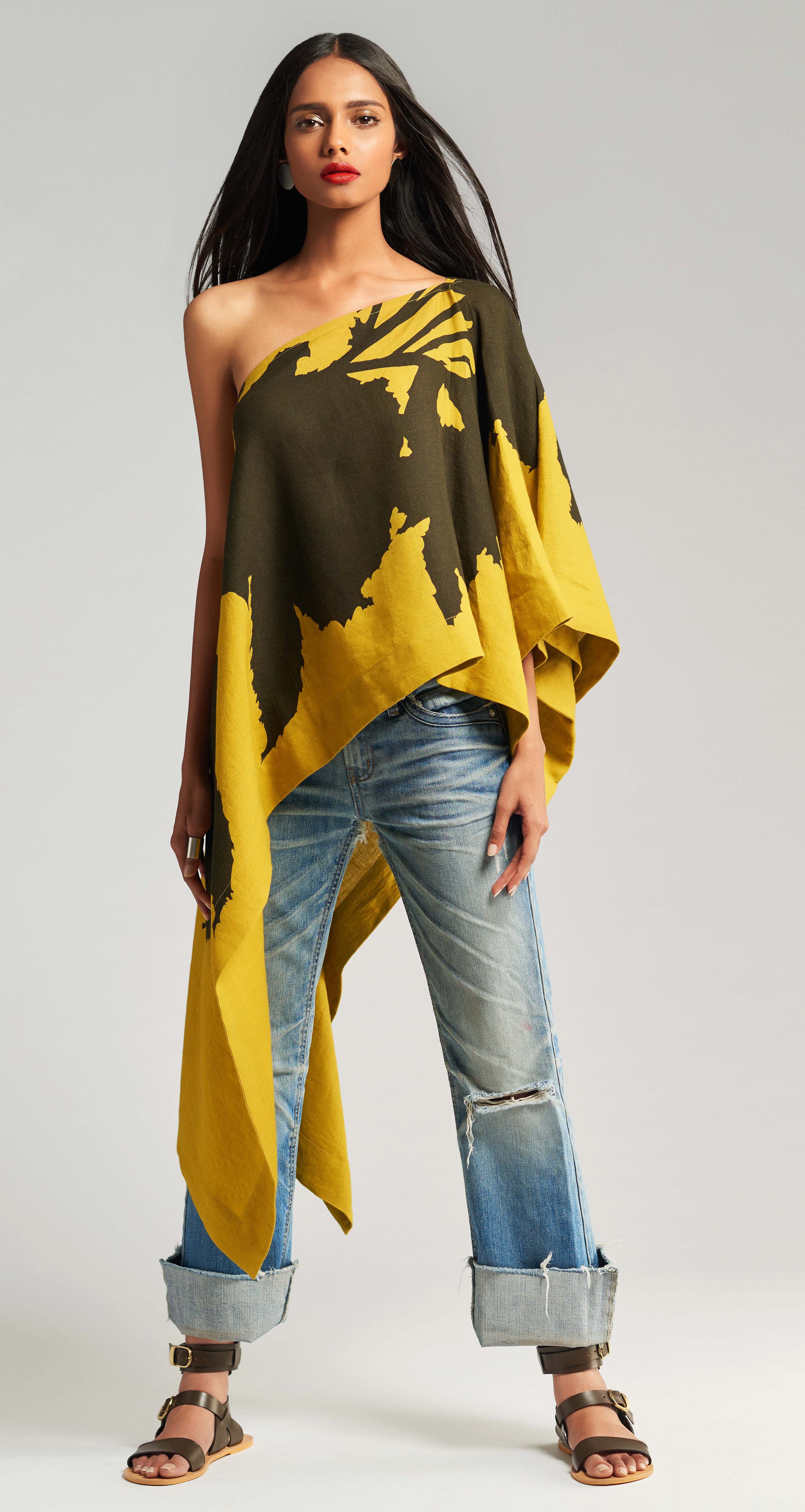
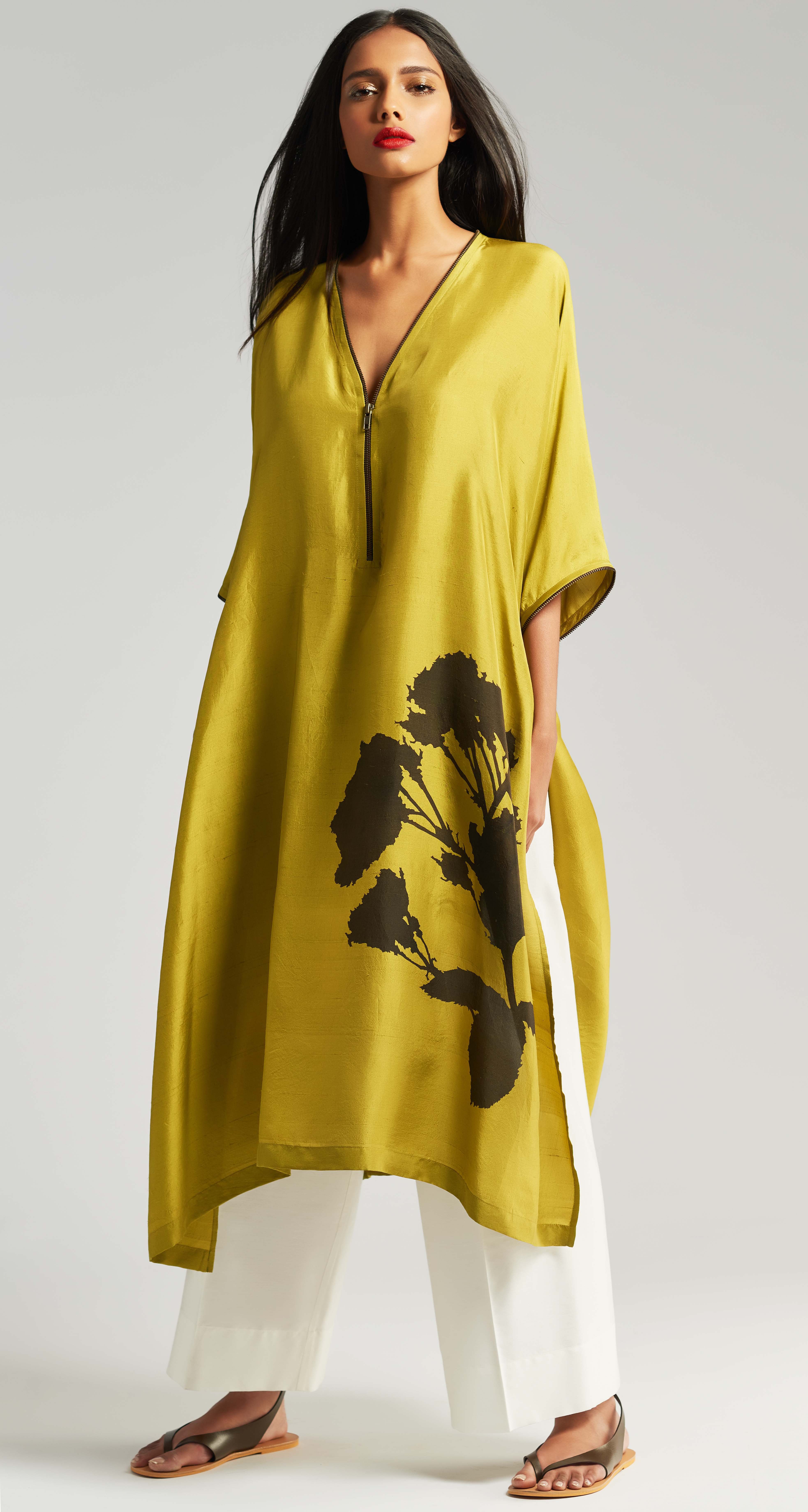
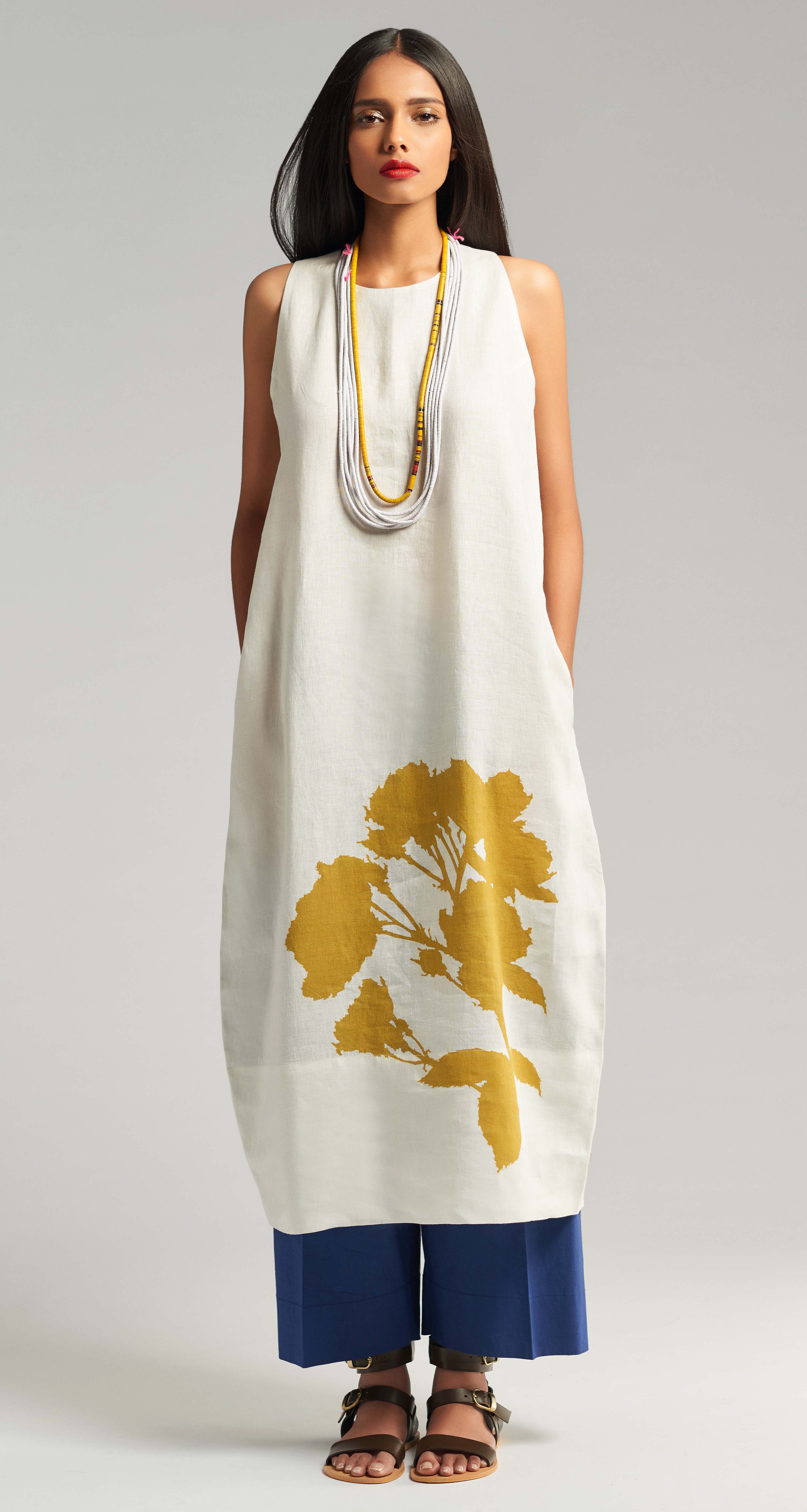
concept.So this season the starting point of our print story was a cluster of
roses - a simple thought, but a strong reference. A motif that is central to
the perceived dichotomy of femininity and strength. Yet I conceived them
as an antithesis of how we typically see flowers in spring, fragile, in full
bloom and in colour. So when I pencilled the artwork, the theme was gentle
in theory but bold in execution. Devoid of pigment and defined by a strong
line; I kept the illustration minimal yet very graphic. The pattern was drafted
freehand on paper and I played with scale and placement to cement this
idea, with a motif that is both fierce but still rooted in something feminine,
much like the clothes themselves. In a stark contrast to our masculine lion
motif last season, our rose is its counterpart this time around.
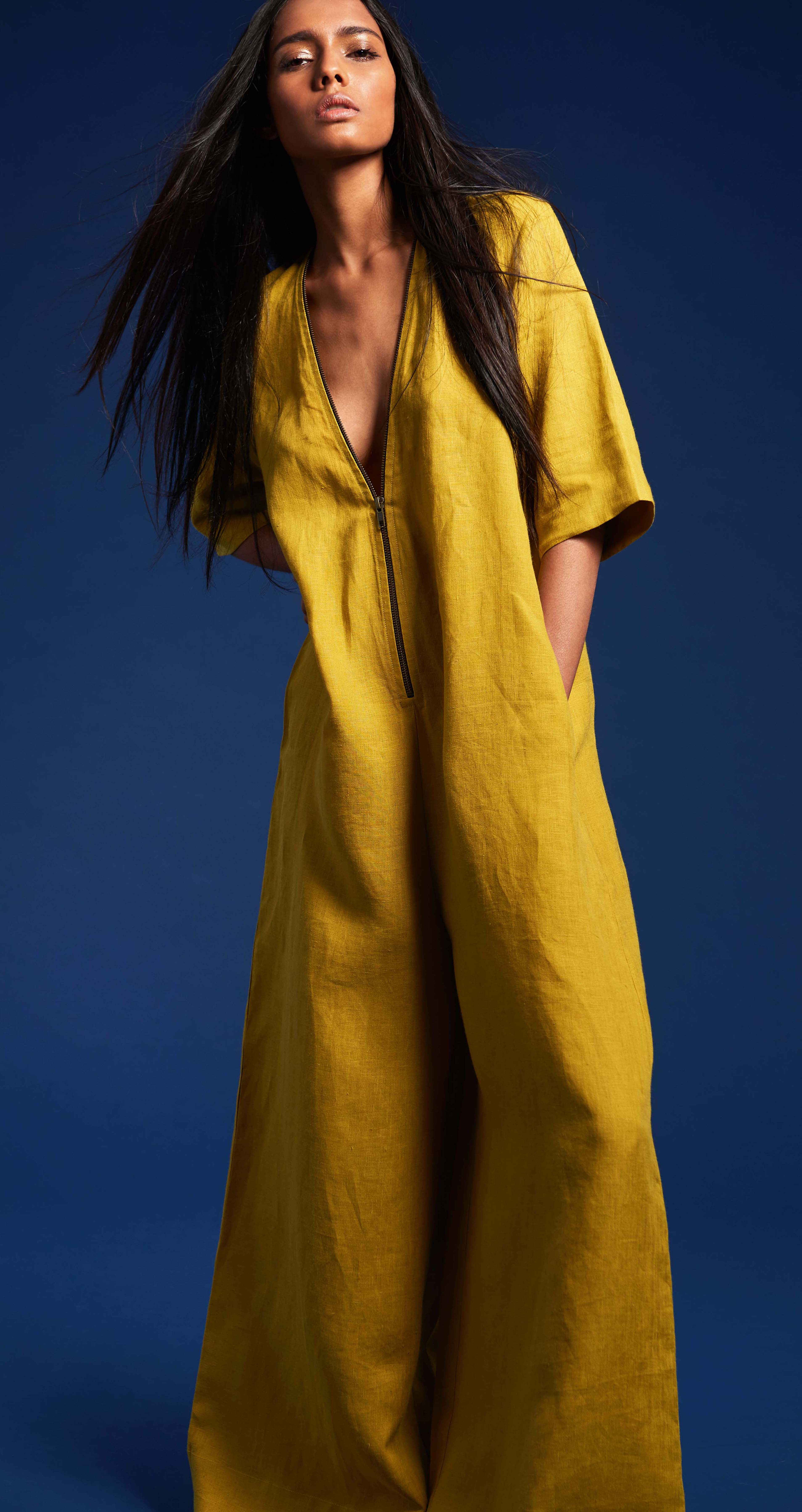
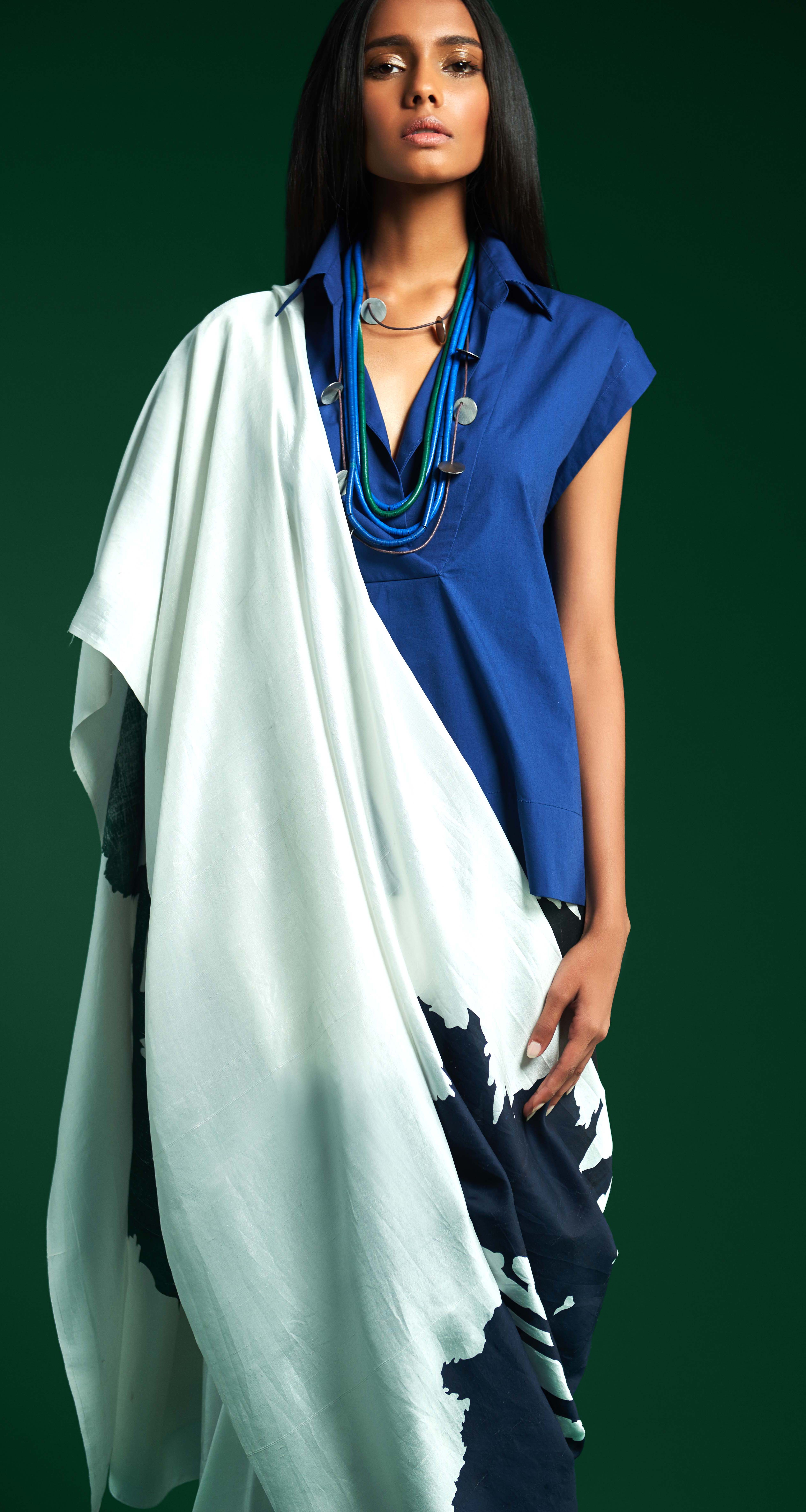
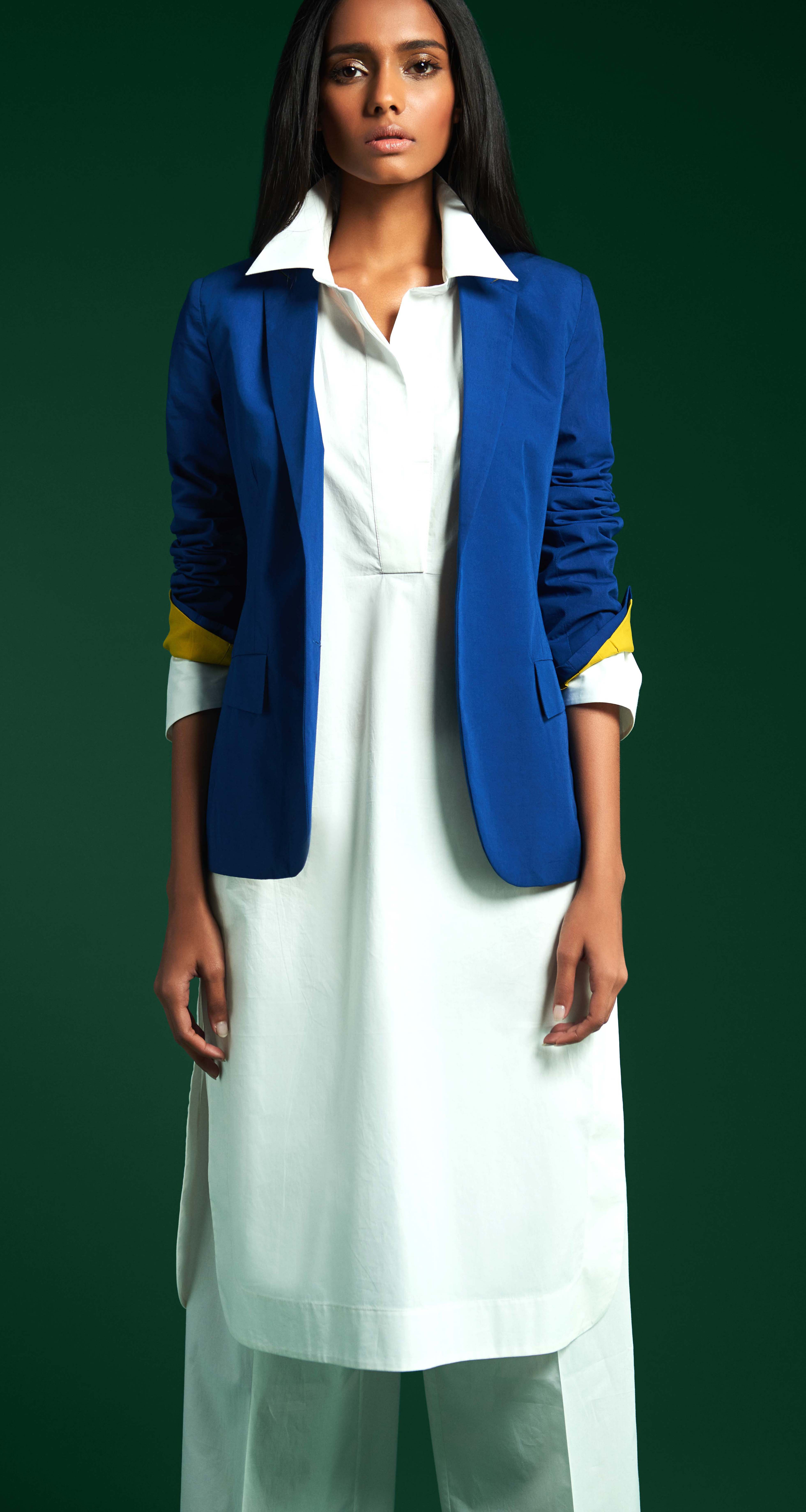
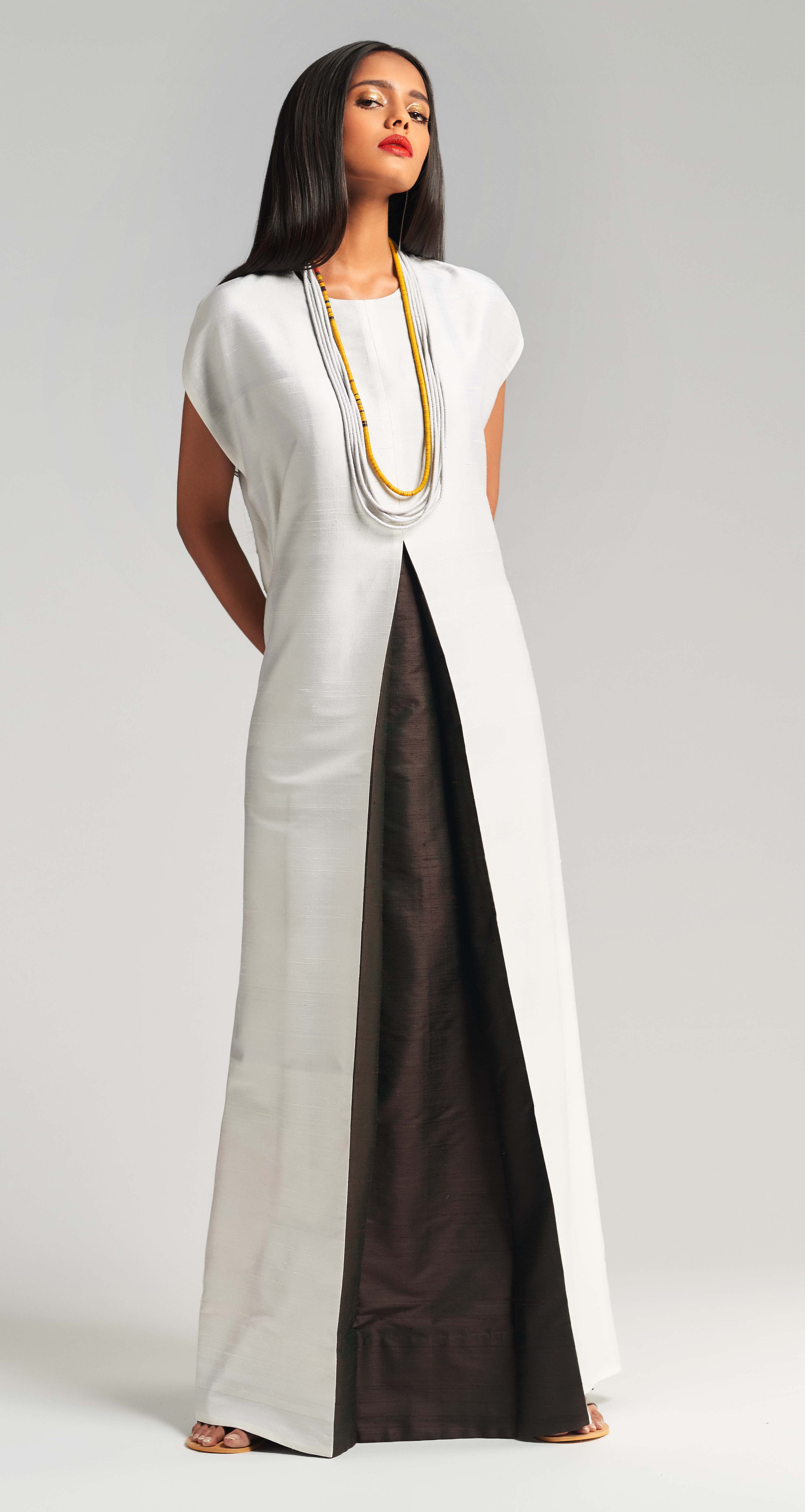
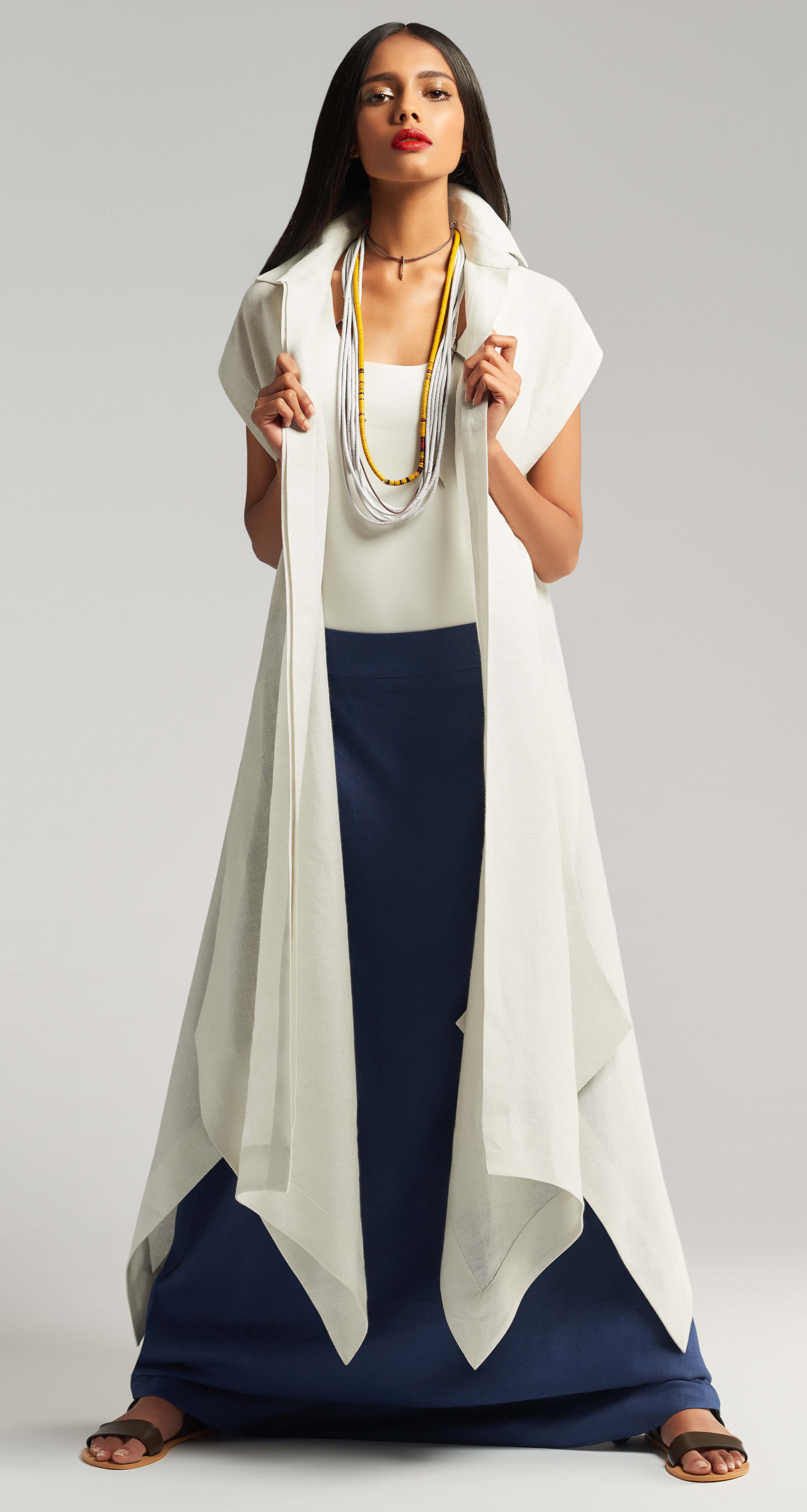
In addition to our palette of coffee, crimson, citrine, indigo and leaf green
our layered separates in pleats, linens, cottons and light silks, also make an
appearance in black and white. A first for our label otherwise synonymous
with a rich jewel toned palette.
This collection marks our five year journey - from the inception of the brand,
to the launch of our label, our two flagship stores in Mumbai, our third store
in store in Delhi, and everything in between.In a way this collection is also
a tribute to all the various indispensable elements that form our visual
vocabulary and what precisely separates us from the rest.

